
Why colour matters before the print starts
When teachers plan a 3D print, colour should be decided at the same time as shape and size. A learner who is printing a science model, a geography feature or a maths aid can use colour to show different parts of the object, not just to make it bright. That small choice can turn a simple print into a proper teaching tool.
In many South African classrooms, especially where there is limited time and shared equipment, colour can do some of the explaining for you. Red might show a warning part, blue can mark water flow, and green can indicate a growing section or safe area. Once learners understand that colour carries meaning, they start planning with more care and their projects become easier to present.
It also helps teachers manage large groups. If each team uses a different colour pallette for its prototype, the class can track which parts belong together without confusion. This is useful during group work, especially when learners move between design, printing and assembly in the same lesson.
Matching colour to the subject being taught
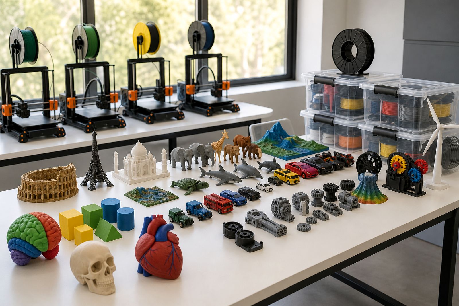
The best colour choices usually come from the subject content, not from personal preference alone. A model for Natural Sciences may need realistic colours if the goal is identification, while a Life Sciences model may work better with bold contrast so structures are easier to see from the back of the class. In Technology lessons, colour can help learners label moving parts, fasteners and support sections.
Teachers do not have to overcomplicate it. The point is to make the model clearer for the learner. If a map, machine part or anatomical model is printed in one flat colour, learners may miss the detail. If the same object uses 2 or 3 planned colours, the class can discuss it more easily and the teacher spends less time explaining the same feature again and again.
- Use contrasting colours for different parts that need to be identified quickly.
- Use one neutral colour for the main body and stronger colours for highlights or labels.
- Use colour to match lesson aims, for example safety, movement, classification or sequence.
- Avoid too many colours on one small print, because it can make the model harder to read.
Keeping classroom colour choices practical
Practicality matters in a school lab. Colour changes can add time, and not every project needs a multi-colour finish. In a busy timetable, especially where load-shedding or short lesson periods can interrupt a session, it helps to choose a colour approach that is realistic. A single strong colour may be enough for a draft model, while a final version can use more detail.
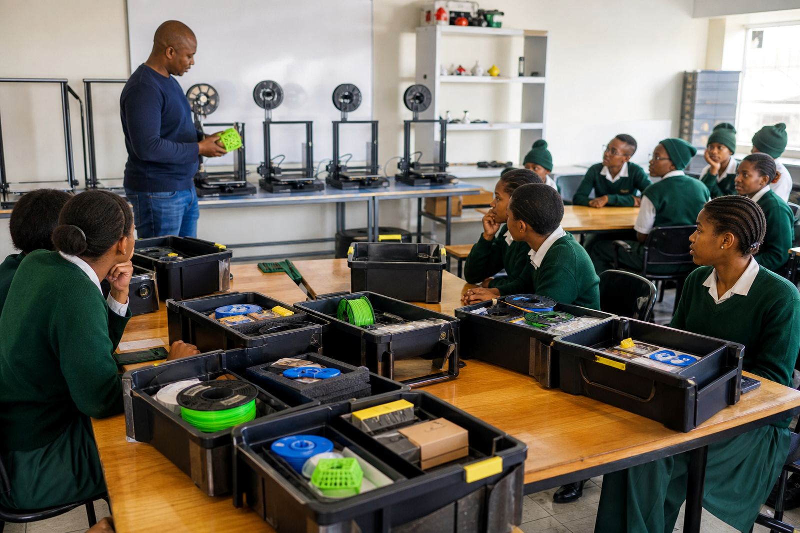
Schools along the coast, such as in Durban or Gqeberha, also need to think about storage. Some materials can be affected by heat and moisture if left near windows or in damp rooms. Keeping supplies sealed and labelled makes the classroom easier to manage, and it helps teachers avoid waste. A neat storage plan also supports consistency when different classes use the same equipment.
For training programmes that cover printer operations and project planning, this is often one of the first lessons: colour should be chosen with the room, the lesson time and the learner level in mind. It is not just an artistic choice. It is part of classroom planning.
Using colour to build confidence in younger learners
For younger learners, colour can reduce fear of complexity. A child who sees a model with clear sections is more likely to understand what each part does. That makes the print less intimidating and gives the learner something concrete to point at during the explanation. In a Maker Club or holiday programme, this can be especially helpful because learners often arrive with very different levels of experience.
Colour also supports teamwork. One learner can design the structure, another can decide the labels, and another can prepare the print settings. Each step feels manageable when colour is used as a guide. Teachers can encourage learners to explain why they chose each colour, which builds language skills as well as technical understanding.
- Ask learners to explain what each colour means before printing starts.
- Use colour to show order, such as step 1, step 2 and step 3.
- Let learners compare two versions of the same model, one plain and one colour coded.
- Keep a classroom record of which colour choices worked well for each topic.
A local example from a Stellenbosch classroom
In Stellenbosch, a teacher preparing a geography lesson on water systems may want learners to understand where water enters, moves and is stored. A colour coded model can make that easier. Blue can show the flow path, grey can show the structure, and yellow can mark parts that need attention during discussion. Even without a full lab, the class can see how the model supports the lesson aim.
That same approach works across the Western Cape and in larger centres like Cape Town, Pretoria and Johannesburg. A school may use a simple colour plan for a single class activity, while a more advanced group may use colour to distinguish parts in a prototype. In both cases, the model becomes a teaching aid rather than just a print object.
For teachers attending a lab setup course or a management briefing, colour planning is worth including in the discussion. It affects the design file, the printing sequence and the final lesson outcome. When the school has a clear process, learners get better results and the teacher spends less time fixing avoidable mistakes.
Simple rules for colour safety and classroom control
Colour choices also connect to safety and order. Bright filaments and printed parts can look attractive, but classrooms still need clear handling rules. Learners should only touch prints once they have cooled, and the printing area should remain separate from eating spaces and crowded walkways. If a printer is running during class, the teacher should keep supervision close, especially with younger groups.
Colour can help with control too. Different trays, bins or labels can be assigned to different project stages. That makes it easier for learners to put parts back correctly after a lesson. It also helps when schools run more than one group in the same room and need a simple system that does not depend on memory alone.
Used properly, colour is not decoration for its own sake. It is a classroom tool that supports clarity, creativity and subject learning at the same time.